
Paint colors for kitchen walls and cabinets can look very different at home than they do on a sample card. In Sammamish, cloudy days, shaded windows, and artificial lighting can change how a color appears throughout the day. A warm white may look creamier at night, while a gray can take on a blue or purple cast in certain lighting.
Before choosing a color, it helps to understand how the shade works with your cabinets, countertops, flooring, and available light. These seven kitchen paint colors offer a starting point for homeowners who want a space that feels comfortable, connected, and practical for everyday use.
Why Kitchen Lighting Matters in Sammamish
Natural light changes the way paint looks. On cloudy days, a kitchen may receive softer daylight than it does on a clear afternoon. Window direction, nearby trees, and surrounding buildings can also affect the amount of light entering the room.
These conditions matter when choosing whites, grays, and other light neutrals. Some colors develop cooler undertones in shaded rooms, while others appear warmer under indoor lighting.
Instead of selecting a color based on how it looks in another home, compare samples inside your own kitchen. A color that looks attractive in a bright showroom may need a different supporting palette in a room with less daylight.
What the 2026 Kitchen Color Trends Tell Us
The National Kitchen & Bath Association’s 2026 Kitchen Trends Report found that 96% of surveyed industry professionals identified neutrals as popular kitchen colors. Greens followed at 86%, with blues at 78%.
The NKBA 2026 Kitchen Trends Report also found that designers expect stronger statement colors to appear on backsplashes, islands, wallpaper, and decorative accessories.
These findings offer useful design directions, but they do not mean every kitchen should follow the same palette. Your existing finishes, lighting, and personal preferences should guide the final decision.
7 Paint Colors Worth Testing in Your Kitchen
These seven colors offer options for light walls, neutral cabinets, and deeper accent surfaces. Each can look different depending on the room, so use them as starting points rather than guaranteed matches.
1. Benjamin Moore White Dove OC-17
White Dove is a soft white with a warm appearance. It is worth considering if you want light kitchen walls without the sharper look of a cooler white.
This shade can work with natural wood, warm stone, and a range of cabinet colors. In a kitchen with limited daylight, compare White Dove with the trim and countertops to see if its warmth feels balanced.
White Dove may also be worth testing on upper cabinets when paired with a darker island or lower cabinetry.
2. Sherwin-Williams Agreeable Gray SW 7029
Agreeable Gray combines gray and beige characteristics, making it a possible choice for kitchens that need a light neutral without using a traditional cream or white.
Its appearance can shift with the light and surrounding finishes. In some kitchens, the warmer side of the color is more noticeable, while other rooms may bring out cooler tones.
Compare it beside cabinet doors, flooring, and backsplash materials before selecting it for the walls. Testing is especially useful when nearby rooms already have gray or beige paint.
3. Sherwin-Williams Evergreen Fog SW 9130
Evergreen Fog is a muted green-gray that offers color without the intensity of a brighter green. It can be considered for an island, cabinets, or a selected wall.
Green shades can pair well with natural wood, light countertops, and warm neutral walls. However, the amount of gray in the color may become more noticeable under certain lighting conditions.
For a Sammamish kitchen with views of trees or a wooded backyard, Evergreen Fog is one option to compare with the colors already visible through the windows.
4. Benjamin Moore Chantilly Lace OC-65
Chantilly Lace is a clean, bright white with a relatively neutral appearance. It is worth testing if your kitchen design calls for stronger contrast between white surfaces and darker cabinets or hardware.
Because it is a bright white, its appearance depends heavily on the surrounding materials and lighting. In a shaded kitchen, compare it with warmer whites before making a decision.
It may work well with natural wood or darker cabinet colors, especially when the rest of the room has enough visual warmth.
5. Benjamin Moore Hale Navy HC-154
Hale Navy is a deep blue that can create contrast against lighter kitchen finishes. It is an option for homeowners who want a stronger cabinet or island color without painting every wall a dark shade.
A navy island can work with white upper cabinets, wood flooring, and lighter countertops. The darker surface becomes a defined feature while the surrounding colors keep the kitchen balanced.
In kitchens with limited daylight, test Hale Navy on a larger sample before committing. Dark colors can appear different across a full set of cabinet doors than they do on a small paint card.
6. Sherwin-Williams Accessible Beige SW 7036
Accessible Beige is a warm neutral worth considering when a kitchen has several different materials and finishes. It can provide a softer background for cabinets, countertops, and wood flooring.
Unlike a bright white, beige introduces a little more warmth to the walls. This may be helpful in a kitchen with cooler daylight, depending on the surrounding colors.
Compare Accessible Beige against your existing trim and cabinet finish. The goal is to find a neutral that works with the materials already in the room rather than creating an undertone mismatch.
7. Benjamin Moore Van Deusen Blue HC-156
Van Deusen Blue is a deeper blue with a muted character. It offers a different direction from brighter blues and can be used as a defined accent in a kitchen.
Consider testing it on lower cabinets or an island beside lighter walls and countertops. Warm wood and metal finishes may help balance its cooler appearance.
Before choosing this color, view the sample during the day and under the kitchen lights at night. That comparison will help you judge how dark the finished surface may appear.
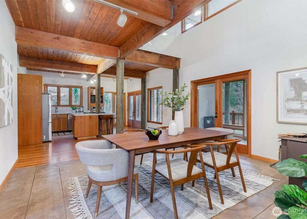
How to Narrow Down the Right Kitchen Color
Seven color options can still feel like too many when each sample looks different throughout the day. Start by deciding which kitchen surfaces will stay the same and which ones you plan to repaint.
If your countertops, backsplash, and flooring are staying, use those materials to narrow your choices. A wall color should work with the larger surfaces around it instead of competing with them.
Once you have a smaller group of colors, compare them with the adjoining rooms. This is especially useful in kitchens that open directly into a living or dining area.
Test Your Kitchen Paint Samples Before Committing
Small paint chips help narrow your choices, but larger samples provide a better view of how a color may appear on the wall. Test your finalists in the kitchen instead of relying on showroom lighting.
Use this checklist before selecting your final shade.
Allow the samples to dry according to the paint manufacturer’s instructions before judging their final appearance. If two options remain close, compare them again under the lighting you use most often.
Choose the Paint Finish Based on the Surface
Kitchen walls and cabinets have different coating needs. Walls may be exposed to cooking moisture, fingerprints, and regular cleaning, while cabinet doors face frequent touching and repeated use.
For kitchen walls, washable satin or certain eggshell products may be suitable depending on the paint manufacturer and surface condition. Cabinet doors require coatings intended for cabinetry, along with proper cleaning, sanding, and priming.
The level of sheen also affects how a color looks under natural and artificial light. Our guide to the best interior paint finish by room explains how different finishes work throughout the home.
For a kitchen project that includes cabinet doors or drawers, learn more about our cabinet painting services.
Common Kitchen Color Mistakes to Avoid
Choosing a kitchen color involves more than finding a shade you like. A few common mistakes can create a result that feels different from what you expected.
Choosing color from a small sample. A paint chip does not show how a shade will appear across a large wall or several cabinet doors. Always compare larger samples in the room.
Ignoring existing finishes. Countertops, flooring, and backsplash materials may contain warm or cool undertones. A color that looks attractive by itself may not work beside those surfaces.
Using the same strong color everywhere. Dark or saturated colors can be effective, but they may feel heavier when applied across walls, cabinets, and an island. Decide which surface should carry the strongest color.
Forgetting about artificial lighting. Kitchen lighting can affect the appearance of paint after sunset. Check each sample under the ceiling, pendant, and under-cabinet lights you regularly use.
Planning the Cost of Your Kitchen Painting Project
The cost of repainting a kitchen depends on the surfaces included, their condition, and the amount of preparation needed. Painting walls alone is different from a project involving cabinets, trim, doors, and ceilings.
Cabinet refinishing may require additional cleaning, sanding, priming, and specialized application. Wall painting costs can also change when drywall repairs or multiple coats are needed.
For a closer look at the factors affecting pricing, read our interior painting cost breakdown. The guide explains how preparation, labor, materials, and project size affect an estimate.
How Paint Pros NW Helps With Kitchen Painting
Paint Pros NW provides residential interior painting and cabinet painting services in Sammamish and surrounding King and Pierce County communities. Our team handles surface preparation, painting, and cleanup for projects ranging from individual rooms to larger interior updates.
Our company has completed more than 350 projects and applied over 7,000 gallons of paint, with more than 100 years of combined team experience. We offer on-site estimates, regular project communication, and a 5-year craftsmanship guarantee.
If your kitchen project includes walls, ceilings, or nearby living spaces, explore our interior house painting services. We can review the surfaces you want painted and discuss the work involved during your estimate.
We also serve homeowners looking for painting services in Sammamish.
Frequently Asked Questions
What paint colors work well in kitchens with limited natural light?
Warm whites, light beige, and soft greige are useful colors to test in kitchens with limited daylight. The best choice depends on the room’s direction, artificial lighting, and surrounding finishes. Compare samples in the kitchen before selecting a shade.
Should kitchen walls be lighter than the cabinets?
Not always, but lighter walls can help balance darker cabinets or a strongly colored island. If your cabinets are already light, a deeper wall color may also work. Consider the amount of natural light and the colors visible from nearby rooms.
Can I use the same paint on my kitchen walls and cabinets?
Kitchen walls and cabinets have different coating needs. Cabinets require products designed for repeated handling and cleaning, along with suitable preparation. Wall paint should be selected based on the surface condition, cleaning requirements, and manufacturer recommendations.
How do I know if a kitchen paint color will look too dark?
Test a larger sample on the surface you plan to paint. Look at it during daylight and under your kitchen lighting at night. You should also compare the sample with countertops, flooring, and other permanent finishes to judge the overall balance.
How much does it cost to repaint a kitchen?
Pricing depends on the kitchen’s size, surface condition, preparation requirements, and the areas being painted. Walls, cabinets, ceilings, and trim may have different labor and material needs. Paint Pros NW provides free on-site estimates to review your specific project.